

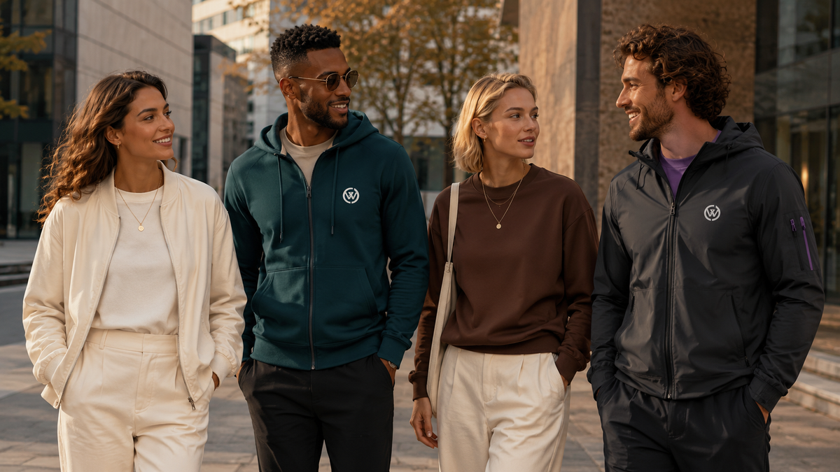
Trend Colors Fall/Winter 2026/27 – Inspiration for Modern Corporate Fashion
Colors are far more than mere design elements.
Colors - trend colors - turn clothing into a brand. They create recognition, convey an attitude, and ensure that employees, teams, and members identify with their apparel.
The trend colors for Autumn/Winter 2026/27 combine calm and naturalness with surprising, expressive accents. Warm earth tones meet deep teal, fresh violet, and vibrant green. The result: corporate fashion that looks high-quality, modern, and distinct.
CREWILD translates these color trends into customizable company, club, and team collections – perfectly matching your corporate design and with no minimum order quantity.
Why trend colors are important for companies and teams
Good corporate fashion should do more than just carry a logo. It should be clothing people enjoy wearing – in the office, at events, in club life, and in their free time.
Current trend colors help to reinterpret classic brand colors in a more modern way and to develop a collection that doesn't look like standard workwear.
When used correctly, colors can:
- strengthen your brand recognition
- make values and brand personality visible
- promote team cohesion
- unify different products into a single collection
- add modern accents without changing the corporate design
- ensure that employee and club clothing is actually worn with pleasure
It is not necessary for every garment to be designed entirely in your company color. Often, a more premium look is achieved through a calm base color combined with targeted accents in trend colors.

The most important trend colors for Autumn/Winter 2026/27
The color trends for autumn and winter show an exciting mix of natural, familiar shades and digital, almost futuristic tones. This fits perfectly with modern corporate fashion: the collections appear long-lasting and contemporary at the same time.
The trend colors predicted for the season by WGSN and Coloro include Transformative Teal, Wax Paper, Fresh Purple, Cocoa Powder, and Green Glow. Together, they combine change, stability, and new energy. WGSN/Coloro Key Colours A/W 2026/27
Transformative Teal – between teal, blue, and green
Transformative Teal is one of the most defining trend colors of 2026. This deep blue-green tone combines the calm of blue with the naturalness of green. This makes it look modern, high-quality, and trustworthy.
Especially suitable for:
- consultancies and service companies
- technology and digital companies
- health, sports, and wellness brands
- sustainable businesses
- clubs and modern team collections
Transformative Teal works excellently as a base color for hoodies, sweatshirts, jackets, training gear, or bags.
The color is particularly strong in combination with:
- cream or off-white
- sand and beige
- anthracite
- light gray
- copper or warm orange
A logo in cream, sand, or tone-on-tone gives teal a particularly high-quality effect.
Cocoa Powder – warm earth tones instead of harsh black
Brown is back – not as a rustic shade, but as a warm, urban, and high-quality alternative to black.
Cocoa Powder is reminiscent of cocoa, dark wood, and natural materials. The color conveys calm, reliability, and value. At the same time, it looks surprisingly modern when combined with bright or bold accent colors.
Ideal for:
- premium corporate fashion
- gastronomy and the hotel industry
- outdoor and tourism companies
- lifestyle and premium brands
- high-quality employee gifts
- clubs with natural or traditional brand colors
Particularly beautiful combinations are:
- Cocoa Powder and cream
- brown and sand
- brown and teal
- brown and orange
- brown and light blue
- brown and gold
On brown hoodies, jackets, or beanies, light embroidery can create an especially elegant contrast. A subtle logo in beige or gold also works perfectly with these trend colors.
Wax Paper – warm off-white for a clean look
Light beige, cream, and warm off-white are increasingly replacing harsh, optical white. Wax Paper appears softer, more natural, and higher quality – while remaining crisp and modern.
This shade is ideal as a calm base for brands seeking a minimalist and stylish appearance.
Especially suitable for:
- agencies and creative companies
- consultancies and premium service providers
- beauty, wellness, and health brands
- modern gastronomy
- schools and universities
- high-quality leisure and onboarding collections
Wax Paper can be combined with almost any brand color:
- teal for a calm, premium look
- black for strong contrasts
- Cocoa Powder for a natural color palette
- dark blue for classic corporate fashion
- purple or green for a modern accent
- sand for a subtle tone-on-tone design
A light-colored hoodie with small, high-quality chest embroidery can often be more impactful than a standard shirt with a large print.
Fresh Purple – creative violet with character
Violet and purple are among the most expressive colors of the season. Fresh Purple looks creative, confident, and digital – without being as loud as classic pink or red.
Depending on the combination, the shade can be used in an elegant, sporty, or progressive way.
Fresh Purple is particularly well-suited for:
- creative and media companies
- technology and gaming brands
- event and festival teams
- fitness, yoga, and lifestyle brands
- universities and modern school collections
- clubs that want to make a conscious statement
Strong color combinations:
- purple and anthracite
- purple and cream
- purple and sand
- purple and dark blue
- purple and vibrant green
- purple and silver
You don't have to design the entire garment in violet. Colored sleeves, drawstrings, zippers, embroidery, or small logo details can achieve the desired effect.
Green Glow – fresh energy as a targeted accent
Green Glow brings brightness and energy to the darker time of year. This fresh green shade is particularly well-suited as an accent color and creates a connection between nature, sports, and modern digital aesthetics.
Ideal for:
- sports and fitness companies
- outdoor brands
- young teams and start-ups
- event clothing
- safety and functional details
- modern club and school clothing
Green Glow works especially well with:
- black or soft black
- deep teal
- dark blue
- anthracite
- purple
- warm off-white
For corporate fashion, we recommend using very bright colors sparingly – for example, for logos, zippers, seams, inner linings, or specific design elements. This creates attention without making the clothing look too busy.

Dark blue, anthracite, and soft black remain important classics
Not every brand needs entirely new trend colors. Dark blue, anthracite, and black remain important foundations for corporate fashion in Autumn/Winter 2026/27 as well. The novelty lies primarily in how these classics are combined.
Instead of a harsh white logo, warm, muted contrasts ensure a more modern look:
- anthracite with sand
- black with cocoa brown
- dark blue with teal
- soft black with purple
- navy with cream
- dark gray with Green Glow
Tone-on-tone finishes are also becoming increasingly important. Black embroidery on a black hoodie or a dark blue logo on a navy jacket looks understated, premium, and fashionable.
The most beautiful color combinations for corporate fashion 2026/27
The impact of a collection is not determined by a single trend color, but by how they work together. For autumn and winter, we particularly recommend these combinations of trend colors:
Teal + Cream
Calm, modern, and premium. Ideal for consultancies, technology companies, wellness brands, and premium teamwear.
Cocoa Brown + Sand
Natural, warm, and approachable. A strong combination for tourism, hotels, gastronomy, and sustainable brands.
Anthracite + Fresh Purple
Urban, creative, and confident. Perfect for agencies, events, universities, and digital companies.
Dark Blue + Warm Off-White
Timeless and professional, but less strict than navy with pure white. Ideal for almost all industries.
Soft Black + Green Glow
Sporty, dynamic, and visible. Especially suitable for fitness, team sports, outdoor, and event clothing.
Cream + Burgundy
Elegant and high-quality. A beautiful color palette for employee gifts, onboarding collections, and special corporate events.

Which products are suitable for autumn and winter?
In the colder seasons, corporate fashion can offer much more than the classic T-shirt. Different products, colors, and finishes can be combined to create a versatile collection.
Particularly suitable are:
- Hoodies and zip-hoodies
- Sweatshirts and pullovers
- Transitional and winter jackets
- Track jackets
- long-sleeved shirts
- polo shirts
- trousers and leggings
- Beanies and hats
- Backpacks, sports bags, and waist bags
- sneakers and other accessories
For example, a dark blue hoodie can be complemented by a cream-colored jacket, a teal beanie, and a matching bag. The logo, claim, and recurring design elements visually unite the individual products into a complete collection.
Printing or embroidery – which finish fits the winter look?
Especially with autumn and winter clothing, the finish plays a major role.
Embroidery
Embroidery looks durable, premium, and textured. It is particularly suitable for:
- hoodies
- sweatshirts
- jackets
- polo shirts
- beanies and hats
- bags
Tone-on-tone embroidery or small logos on the chest look especially sophisticated. For more visibility, the back, sleeves, or hood can also be customized.
Printing offers more freedom for large motifs, gradients, claims, and creative designs. It is particularly suitable for:
- shirts and long sleeves
- large back prints
- event clothing
- sporty collections
- striking team and club designs
At CREWILD, embroidery and printing can be combined within a single collection. This creates an individual design that fits both the brand and the respective product.

Correctly integrating trend colors into corporate design
Trend colors should complement your brand – not replace it. That is why a good corporate fashion collection always begins with the existing brand identity.
Our recommendation:
- Define a calm base color for the most important items of clothing.
- Use your corporate color or a trend color as an accent.
- Use recurring details on different products.
- Ensure sufficient contrast for logos and fonts.
- Consider which colors your team actually likes to wear.
- Plan the collection so that it works across several seasons.
Often, small changes are enough: a different-colored zipper, a contrasting inner lining, embroidery on the sleeve, or a claim on the back.
Your individual Autumn/Winter collection with CREWILD
At CREWILD, you don't just get interchangeable standard clothing with a logo slapped on it. Together, we develop your collection, tailored to your company, club, association, school, or university.
Your advantages:
- completely customizable clothing and accessories
- large selection of products, colors, and designs
- printing and embroidery
- personal names, initials, and numbers possible
- individual mockups before production
- design consultation and joint implementation
- no minimum order quantity
- production on demand
- individual reorders possible
- optional private shop for your team
You can start with a single product or assemble a complete autumn/winter collection right away.
Conclusion: Autumn and winter can show off some color
Corporate fashion doesn't automatically have to be black, gray, or dark blue in autumn and winter. The 2026/27 trend colors show how natural base colors, deep tones, and vibrant accents can be combined with one another.
Teal conveys modernity and trust. Cocoa Brown provides warmth and value. Cream creates a clean, premium look. Purple brings creativity into play, and Green Glow sets energetic accents.
The key is not to follow every trend, but to select the right colors – trend colors for your brand – and develop them into a collection that people love to wear.
Ready for your own autumn/winter collection?
Together with you, we design individual corporate fashion, club apparel, or teamwear – matching your brand, your team, and your budget.
No minimum order quantity. No standard solutions. Just plenty of possibilities.
Inquire now without obligation and develop your own collection.
Review: Trend Colors Spring/Summer 2026
The trend colors from spring and summer also remain relevant for year-round collections. Sand, sage, powder blue, and warm pastel tones can be ideally used as a light complement to bolder autumn and winter colors.
The following combinations are particularly harmonious:
- Sage with Cocoa Brown
- Powder blue with dark blue
- Sand with Transformative Teal
- Pastel violet with anthracite
- Cream with bold green
This allows existing summer products to be integrated into a new autumn/winter collection without having to change the entire brand identity.
Behind CREWILD is Time Of Vibes UG (haftungsbeschränkt), based in Munich. From the initial idea and design to production and delivery, you will have a personal contact partner. We produce mainly in Europe and deliver your individual collection throughout Europe.
CREWILD
Corporate Fashion in trendy colors

Secure your free initial consultation here
In addition, for every item we sell, we plant two trees in cooperation with the organization Sprout for the Eden Reforestation Projects.
Style - Individuality - Sustainability

Discover new looks, colors, designs, and CREWILD vibes on Pinterest.
From fashion and beachwear to sports, travel, and new design ideas.
Teamwear Collections

Design custom beanies & hats

Design your own pants, shorts & leggings

Customise your jackets

Customize Shoes, Sneakers & Flip-Flops

Design your own shirts

Customize bags

Design Your Own Sweatshirts & Hoodies

Custom-design swimwear & beachwear

Design custom school & university apparel

Customize sportswear


Quick Links
-
Collections
Click hereCurious? Click here for our CREWILD products and soon for your own collection!
-
FAQ
Click hereIf you have any further questions, please check our FAQs. Here you will find all important information at a glance!
-
Contact
Click hereWould you like to speak with us and receive a non-binding consultation? Use our contact form for your inquiry!